Introduction
Swiss Coffee Benjamin Moore Walk into any paint store and ask for “just a simple white.” Twenty minutes later, you’ll walk out holding four cards that all look the same. Yet somehow, they feel completely different. That’s the strange thing about white paint. It’s never really just white. Some shades read cold under morning light. Others turn almost yellow by evening. Swiss Coffee by Benjamin Moore seems to know how to behave no matter what room it’s in.
There’s a reason this color keeps showing up in designer portfolios and renovation photos, year after year. It doesn’t try too hard. It’s not the loudest white on the shelf. It’s not the coldest either. Homeowners who’ve lived with it describe the same thing: walls that feel calm and quietly warm, without tipping into “cream” territory.
Maybe you’re standing at the paint counter right now, wondering if Swiss Coffee is the one. It helps to understand what you’re actually getting. How does it behave in your lighting? Which rooms does it flatter? What does it look like next to your floors, cabinets, or trim? This guide walks through all of it.
What Is Swiss Coffee by Benjamin Moore?
Swiss Coffee carries the paint code OC-45. It belongs to Benjamin Moore’s Off-White Collection, a lineup built around soft, adaptable neutrals rather than stark, gallery-white shades. That distinction matters more than people realize. Many “white” paints aim for crisp and bright. Swiss Coffee aims for livable.
Its Light Reflectance Value (LRV) sits around 81.9. This scale runs from 0 to 100 and measures how much light a color bounces back into a room. A higher LRV usually means brighter, more open walls. At nearly 82, Swiss Coffee reflects plenty of light without feeling clinical or sterile, the way some near-white shades can.
Technically, it counts as an off-white. Most people just call it white and move on. Then they paint two walls side by side and notice how much softer this one looks compared to a “true” white. That softness comes from one thing: undertone.
Swiss Coffee Undertones Explained
Here’s something nobody tells you before you buy five gallons of paint: two whites can look nearly identical on a small sample card. Once they cover four walls, they can read completely differently. The culprit is always undertone, the faint secondary color hiding underneath the main shade.
Swiss Coffee’s undertone leans warm, with soft touches of yellow and beige running underneath the white. The effect is subtle. This isn’t a cream paint pretending to be white. The warmth stays restrained, so most people just see “a nice, soft white” rather than noticing the yellow undertone directly. That’s part of the appeal. It warms up a room without anyone quite explaining why the space feels cozy.
Warm vs. Cool Undertones
Whites generally fall into two camps. Warm whites carry hints of yellow, cream, or beige, and they make rooms feel inviting and lived-in. Cool whites lean toward gray or blue, producing that crisp, architectural look you see in minimalist interiors.
Swiss Coffee sits in the warm camp, but it stays restrained about it. It’s not creamy enough to feel dated. It’s not neutral enough to feel cold. That middle ground explains why it works across farmhouse, transitional, coastal, and fairly traditional spaces. It doesn’t fight a room’s existing style. It supports whatever’s already there.
How Lighting Changes the Way It Looks
No paint color exists in a vacuum. Swiss Coffee responds strongly to the light around it, and that’s both its strength and the one thing people underestimate before painting.
South-facing rooms get strong, warm sunlight throughout the day. Here, Swiss Coffee looks bright and gently creamy, probably its most flattering setting. North-facing rooms get cooler, flatter daylight. In these spaces, Swiss Coffee mutes slightly and looks softer and more neutral. It won’t turn cold, though. The warm undertone protects against that.
East-facing rooms shift throughout the day. Morning sun makes Swiss Coffee look fresh and lively. Afternoon shade calms it down into something more neutral. West-facing rooms run the opposite pattern. They start neutral in the morning, then warm up as the evening sun pours in.
Light bulbs matter too. Warm LED bulbs pull out the creamy side of Swiss Coffee, which looks lovely in the evening. Cooler-toned bulbs tone that warmth down and give the paint a cleaner look. None of this is a flaw. It just means you should test the color in your actual space first. The same paint can look like two different colors in two different rooms.
Best Rooms to Use Swiss Coffee
Swiss Coffee earns its reputation through versatility. It travels from room to room without losing its character.
Living Room & Bedrooms
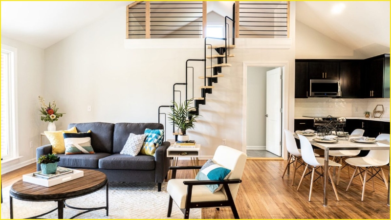
In a living room, Swiss Coffee quietly makes a space feel open and bright. It still feels comfortable enough to relax in. It skips the sharp, almost sterile edge that some bright whites bring into a room meant for unwinding.
Bedrooms benefit the same way. Instead of a stark backdrop, you get something soft enough to sit behind heavy textured bedding, warm wood furniture, or a gallery wall. It doesn’t compete for attention. And because it isn’t chasing a trend, you can swap out pillows, art, or furniture years later without the walls feeling out of place.
Kitchen & Cabinets
Kitchens are unforgiving spaces for paint. Task lighting, changing daylight, and reflective countertops show every flaw. Swiss Coffee holds up well here. It stays bright without sliding into the cold, clinical look that pure whites sometimes create.
It’s also become a go-to for cabinetry. The warmth stays subtle enough that it won’t scream “cream cabinets.” Yet it softens the hard edges of an all-white kitchen. It pairs well with a wide range of countertops, backsplash tile, and flooring. That gives you room to change other finishes later without repainting.
Trim and Ceilings
Most people use one paint color only on walls. Swiss Coffee works surprisingly well across walls, trim, and ceiling together. Painting everything the same tone removes the hard visual lines where wall meets trim. The room ends up feeling larger and more unified.
This monochromatic approach works especially well in rooms with high or vaulted ceilings. An all-white ceiling can sometimes feel stark or disconnected up there. Swiss Coffee keeps things bright without making the room feel cold or empty.
Swiss Coffee vs. Other Popular Whites
On paper, a lot of off-white paints look interchangeable. On a wall, they rarely are.
Some popular whites lean hard into gray undertones. That gives them a crisp, modern edge, great for certain contemporary spaces, but occasionally cold in rooms that don’t get much natural light. Others swing the opposite way, leaning so far into cream or yellow that they can look dated, especially next to honey-toned wood floors or warm lighting.
Swiss Coffee lands in the sweet spot between those two extremes. It’s warm enough to feel welcoming. It stays restrained enough to still read as “white” rather than “cream.” And it’s neutral enough to avoid clashing with most flooring and furniture. That balance explains why it’s remained a go-to choice for so long. It doesn’t ask a room to adapt to it. It adapts to the room.
How to Pair Swiss Coffee Benjamin Mooree With Other Colors
Pairing is where Swiss Coffee earns its reputation as a “safe but never boring” choice.
For walls and trim, many homeowners keep trim in the same Swiss Coffee shade. Others step up to a slightly brighter white for subtle contrast, enough to notice, not enough to feel harsh. For an accent wall or adjoining room, deeper warm neutrals, soft greens, or navy sit beautifully against it. Swiss Coffee’s warmth keeps those bolder colors from feeling too heavy.
Natural materials shine against this color: light oak, walnut, rattan, linen, brass hardware. Because Swiss Coffee isn’t stark, it lets those textures do the visual work instead of competing with a too-bright backdrop.
On exteriors, it’s become a favorite for modern farmhouse and traditional homes. Homeowners often pair it with black or bronze window frames, stone accents, or a darker front door for contrast. The warmth keeps a white exterior from looking flat, especially in strong daylight.
Tips for Testing Swiss Coffee Benjamin Moore in Your Home
Buy the sample before you buy the gallons. This one step saves the most regret. Paint a large swatch, at least two feet wide, on more than one wall, since walls facing different directions show the color differently.
Check it at three points in the day: morning, midday, and evening with your lamps on. What looks perfect at noon might read completely differently once night falls. Hold the sample near your flooring, cabinetry, or any large furniture piece staying in the room. This step catches undertone clashes early, before you paint the whole room.
Common Mistakes to Avoid
The most common misstep: trusting a paint chip under the store’s fluorescent lighting. That chip almost never looks the same at home. A close second: skipping the wall test and painting straight from a can based on photos online. That ignores how different every room’s light really is.
One more mistake worth mentioning. Many people forget to check undertones against existing flooring. Swiss Coffee’s warmth generally plays well with most wood tones. Very cool-toned gray flooring, though, can sometimes clash, and that clash often only shows up once the whole room is painted. A five-minute test beforehand saves a lot of frustration later.
Final Thoughts
Swiss Coffee Benjamin Moore has stuck around for a Cause. It isn’t the trendiest white on the market, and it never tried to be. It’s the reliable, adaptable choice that works whether you’re painting one accent wall or an entire home. Test it in your own light, against your own floors and finishes. There’s a good chance it’ll do exactly what it’s done in thousands of other homes: quietly make the space feel better.